Ads That Look Mid, Perform Big
🎯 The anatomy of high-performing ads that stop the right people,and move them to click
Welcome to a space where every edition delivers insights, strategies, and inspiration to fuel your advertising brilliance. 🤯
🎯 Ads That Look Mid, Perform Big: The anatomy of high-performing ads that stop the right people,and move them to click
Stop Over-Designing. Start Anchoring.
The most effective static ads don’t win awards. They don’t glow, they don’t spin, they don’t scream. But they work,because they hit three core psychological anchors that make people stop, feel something, and click.
While most DTC brands are chasing style, the winners are chasing relevance, clarity, and emotional resolution. If your ad hits those three, it converts,even if it looks like a Notes app screen.
Anchor 1: Instant Relevance (a.k.a. “This Is About Me”)
This is the first and most important filter. If the viewer doesn’t feel like the ad is about them within the first second, they scroll. It’s that simple. But here’s the twist: relevance isn’t just demographic. It’s emotional context.
- “Why I’m ditching my regular toothbrush for THIS”
- “MOM: Are you ALWAYS sleepy?”
- “I used to get UTIs every month,until I tried this.”
These lines work because they mirror the reader’s private conversations,not the brand’s positioning.
Tools like Brand24 help you mine these exact insights by showing what people are saying about your product category, in their own words. No guesswork. Just real, raw input. You can book a free demo here!
Anchor 2: Visual Clarity
Once you’ve caught their emotion, the next 2 seconds are for the brain. The viewer asks: What am I looking at? What do I do now?
You need to:
- Show the product form (not just packaging)
- Use layout to guide the eye left → right or top → CTA
- Never make them zoom, squint, or guess
Clarity doesn’t kill creativity,it amplifies it. First Day nails this by showing the actual gummies, not just a jar. Hismile puts all product colors side-by-side to eliminate choice anxiety.
Anchor 3: Emotional Resolution
This is where trust lands,or dies. If the ad ends on a soft, vague CTA, people hover… then bounce. But if it resolves tension,“I’ve been there, and here’s what helped” they click.
Examples:
- Happiness guarantees
- Review counts placed after the hook, not before
- Simple quotes that shift identity: “Now I don’t have to think about it anymore.”
This is where conversion lives: not in the clickbait, but in the settling.
Static ads don’t need motion. They need meaning.
If you build every frame with these 3 anchors, emotional relevance, visual clarity, and tension resolution, you stop trying to impress everyone… And start clicking with the people who were always one moment away from saying yes.
Together with Growth School
🚀 Proven Roadmap to Making $100k Using LinkedIn & AI
It shocks me how few people leverage LinkedIn to its full potential, even in 2025.
And if you think it’s just a job-hunting platform, think again!

This 2-hour workshop on LinkedIn will explain everything and teach you how to:
👉 Automate lead generation to scale your business effortlessly.
👉 Dominate LinkedIn's $100K strategy and watch your revenue soar
👉 Leverage AI to land high-paying roles without drowning in job applications.
💰 Valued at $399, but it's FREE for the first 100 participants.
🚀 Reel of the Day
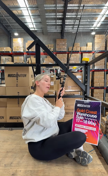
The reel opens in a warehouse, but instead of a sales setup, we see her sitting on the floor with a fishing rod. She’s mouthing along to a trending audio about waiting for the “big big fish.” And here’s the twist: attached to the rod is a pamphlet for the sale. That detail isn’t random, it’s the bait.
Her deadpan lip-sync sells the bit. She fully leans into the character, keeping a calm expression as she sings about waiting all day.
As soon as she drops the rod, the pamphlet leads the line downward like bait in the water… and boom, the entire Muscle Nation team collapses like hooked fish. It’s timed perfectly.
The Muscle Nation logo is on boxes, hoodies, and signs in every frame. But the standout? That neon-purple warehouse pamphlet. It stays visible throughout, including while it dangles on the rod.
Broader Insights:
Because it doesn’t feel like a promo. It feels like a group of friends messing around, and oh, by the way, there’s a warehouse sale. The rod, the reel, and the ridiculous flopping all point to one truth: this team knows how to sell fun.
Thanks for reading this edition! Keep pushing boundaries, testing ideas, and staying inspired. See you in the next edition with more ways to ignite your marketing success. 🥰