Creative fatigue is a myth?
😮Persona collapse is the real performance killer
Welcome to a space where every edition delivers insights, strategies, and inspiration to fuel your advertising brilliance. 🤯
😮 Creative fatigue is a myth?
You don’t have a creative fatigue problem. You have a persona collapse problem.
Most “new ads” today are just recycled ideas in a new outfit. Slightly different hook, alternate creator, maybe even a new layout, but if the first 3 seconds feel the same emotionally, Meta treats them as identical. So does your audience.
Andromeda, Meta’s creative similarity engine, doesn’t look at filenames. It looks at emotional tone, rhythm, and contextual setting. If those match, your CPMs go up and your scale stalls, no matter how many variations you launch.
Why Most Brands Run 10 Lookalike Ads Dressed in 10 Outfits
Here’s the trap:
- “Struggling to fall asleep?” woman tossing in bed
- “Tired of waking up groggy?” man yawning in the kitchen
- “Trouble staying asleep?” same setup, new actor
The words change. The footage doesn’t. Emotion: frustration. Setting: early morning. Pace: slow and moody. That’s 3 ads. But to Meta and your customer, it’s one repeated three times.
Build Real Micropersonas (Not Just Copy Variants)
The brands that break out in 2025 will build creative around actual life context, not just surface-level themes. Here’s your starting grid:
1. Life Stage Snapshot
- First-time buyer: “Got your first apartment? Don’t know what half this stuff does?”
- Empty nester: “House feels quiet, but your old habits are loud.”
2. Time-Based Stressor: Morning chaos: “Late again. And of course, the bottle’s empty.” Night wind-down: “You made it to 10pm. Barely.”
3. Location + Visual Cues: Dorm room, noisy street, minimalist kitchen, Uber car, tropical background, each says something without needing words.
4. Emotional Driver: Is this ad anchored in relief, control, pride, or urgency? Each tone needs its own pacing, sound, color, and visual rhythm.
You don’t need 1,000 personas. You need 6–10 fundamentally different life moments that people instantly recognize and relate to.
The Real Work: Frame Differentiation, Not Copy Rotation
“Save 15%” can work, but only if it’s framed through different life lenses:
- A young couple struggling with baby expenses
- A rideshare driver trying to boost margins
- A college student tired of borrowing dad’s insurance
Every one of those opens a new targeting layer. Most agencies settle for “variations.” The top brands weaponize micropersona diversity to keep frequency high without driving fatigue.
If it feels different in the first 3 seconds, it performs differently. If it doesn’t, it dies fast. Now’s the time to drop the lazy remix strategy. Start building ads that show up in your customers’ actual lives, not just their feeds.
Together with Neurons
🧠 Your Ad Looks Great. But Will Anyone Remember It?
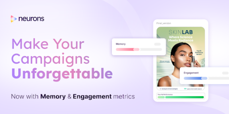
In a scroll-happy world, attention isn’t enough; retention is the new ROI.
Neurons now includes memory and engagement scoring, so you can predict not just if someone sees your ad, but if they’ll recall it days later.
Here’s how it works:
✅ Upload your creative (image or video)
✅ Neurons simulates real audience reactions based on years of neuroscience data
✅ You get instant metrics: Memory retention, emotional impact, and engagement breakdown
The result? Actionable feedback you can use to fix forgettable ads before they cost you money.
Creative teams using Neurons have seen up to 73% boosts in CTR and 46% more conversions on Meta ads.
Want your next campaign to leave a mark?
Start your 14-day free trial today!
🎥Reel of the Day
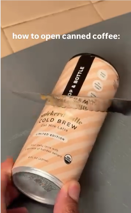
✅ What Works
1. Inverted how-to = instant pattern break - The hook text promises utility (“how to open…”), then violates expectation with a ridiculous knife-through-can demo. It also taps a familiar Khabane Lame meme so the joke is pre-understood.
2. Benign violation, not brand violation - The spill and mess feel naughty but harmless; no injury, no sharp close-ups, no real waste shown for long. The can’s USDA/benefit badges remain visible, so credibility isn’t undercut. Humor lands without making the product look fragile or flawed.
3. Label-first composition doubles as subtle PDP - Throughout the chaos, the full wrap label faces camera, flavor (“Snickerdoodle”), “Oat Milk Latte,” “No refined sugar,” etc. The joke gets the view; the packaging gets the memory imprint. It’s ad recall without feeling like an ad.
Comedy carries the click; clarity earns the save. Build short anti-tutorials that open with an absurd “wrong way,” keep brand cues visible, and land on a 1-step, satisfying “right way.” That combo maximizes retention, recall, and shareability, without production bloat.
Thanks for reading this edition! Keep pushing boundaries, testing ideas, and staying inspired. See you in the next edition with more ways to ignite your marketing success. 🥰