The CVR Killers in your Layout
📉 Why most PDPs lose conversions halfway down the page, and how to fix it.
Welcome to a space where every edition delivers insights, strategies, and inspiration to fuel your advertising brilliance. 🤯
📉 The CVR Killers Lurking in Your Layout: Why most PDPs lose conversions halfway down the page, and how to fix it.
It’s not your price. It’s not your product. It’s your layout, and chances are, it’s quietly tanking your conversion rate (CVR). If you’re running a DTC brand, your product detail page isn’t just a digital brochure. It’s a decision-making battlefield.
Here’s why most PDPs fail to convert, and how to fix the hidden killers in your design:
1. The Dead Zone Effect: Mid-Fold Blind Spots
Most PDPs have a high-performing top fold (with hero images, pricing, CTA), and a trust-heavy bottom fold (with reviews, FAQs, etc). But in between? A dead zone. That middle section often gets ignored in design sprints and becomes a lifeless scroll graveyard of filler copy, redundant icons, or awkward white space.
Fix it by:
- Treating the mid-fold as a second CTA opportunity (e.g., “Why customers love this” or “How it works in 3 steps”)
- Using scroll-triggered modules that reward interaction (like collapsible benefits or ingredient reveals)Placing tension-breaking elements like social proof sliders or review snapshots mid-scroll
2. Text Bloat vs Visual Scannability
Too many brands treat PDPs like long-form sales letters. But mobile-first shoppers don’t read, they skim. Huge paragraphs, dense feature lists, or academic language? They’re retention killers.
Instead, scannability wins attention.
Upgrade by:
- Writing in clusters: short bursts of text + icons or images
- Using strategic bolding and bullets to guide the eye
- Ensuring each scroll reveals one core message, not five competing ones
3. The Upsell Overload Paradox
Yes, upsells boost AOV. But badly timed or overly aggressive add-ons erode trust and sabotage the primary purchase.
Customers who haven’t committed to one SKU don’t want to be pitched three more before clicking “Add to Cart.”
Upsells should feel like thoughtful curation, not a last-minute ambush.
Calibrate by:
- Delaying upsells until after the first CTA interaction
- Using “complete the experience” language instead of “bundle and save” pressure
- Testing carousel-based vs static upsell layouts to reduce visual clutter
Most PDP optimizations obsess over pricing tests and subscription logic, but the biggest CVR gains often come from structural clarity. When you remove dead zones, reduce mental load, and sequence upsells with care, your product page becomes frictionless.
And frictionless pages convert. Every. Time. Ready to fix your layout blind spots? Your next 10% CVR boost may not require a new offer—just better flow.
Together with The Shift
You’re Not an AI Beginner. You’re Just Learning It Backwards.

You don’t need another explainer thread.You need to unlearn the slow way people are picking up AI.
At The Shift AI, we help you flip the script and go straight to application.
✅ Build AI workflows that replace manual processes
✅ Use prompts to think better, not just type faster
✅ Automate outcomes, not just responses
Most people start with tools. You’ll start with strategy.
Join today and get 2000+ top tools, 300+ proven prompts, and access to our free AI courses.
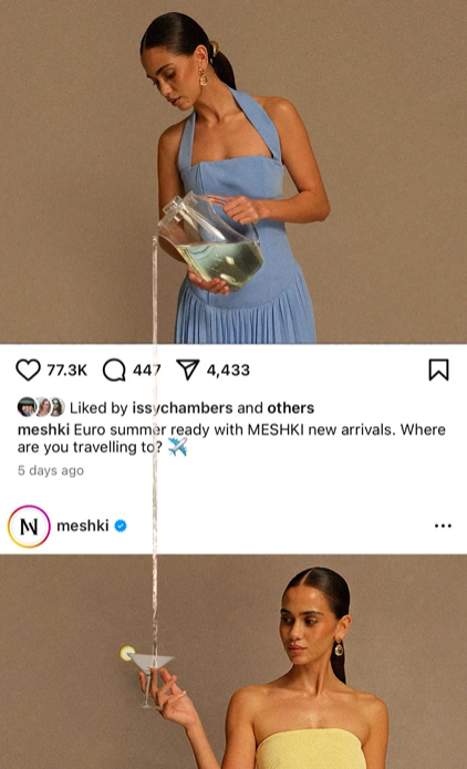
📽️ Reel of the Day
What Works:
Concept Format – Static Image, Moving Impact - This reel mimics a paused Instagram scroll, freezing viewers mid-swipe. By faking a still post and animating only the water pour, it flips expectations and forces attention.
Illusion Design – Cross-Post Interaction - Both models are from two “posts” within the same screen, but the water flows from one image to another, breaking the boundaries of content. It’s a visual sleight of hand that feels cinematic, surreal, and disruptive in the feed.
CTA Integration – Caption as the Campaign Anchor - The real hook isn’t just the illusion, it’s the embedded caption in the post: “Euro summer ready with MESHKI new arrivals. Where are you travelling to? ✈️”. It subtly delivers campaign messaging while the eyes are locked on the pour.
Sensory Detail – ASMR Pouring Audio - That crisp, delicate water-pour sound activates sensory engagement. It contrasts the quiet stillness of the “post,” grounding the illusion and enhancing the surprise factor.
Broader Insights:
This reel works because it hijacks the behavior of passive scrolling and injects motion into a static space. The illusion isn't a gimmick—it’s used to nest the brand’s CTA inside a creative magic trick. In 3 seconds, you get visual shock, campaign messaging, and aesthetic branding simultaneously.
🪩Extensions
Guidde uses AI to turn any workflow into a polished step-by-step video guide. Just hit “Capture” on the browser extension, and it records your screen, adds voiceover, highlights each step, and builds the entire doc for you.
No editing, no formatting — just one click and it’s done.
Install the free extension today.
Use it the next time someone asks, “Can you show me how?”
Thanks for reading this edition! Keep pushing boundaries, testing ideas, and staying inspired. See you in the next edition with more ways to ignite your marketing success. 🥰